We’ve all been inside houses or rooms that felt … flat. Even with custom millwork, plentiful natural light, and new furniture, some spaces feel rich and others feel one note. Customization and expense aren’t enough to ensure a home will be striking. So what gives?
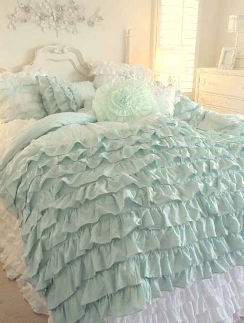
One of the main factors is palette. Houses that feel rich have a varied palette, while those that do not resonate with depth have a shallow palette—think one favorite color used over and over (see photo above). And that’s it.

What works better is to choose a few harmonious colors and use them again and again throughout the house—in paint, furnishings, art, décor, rugs, and more.
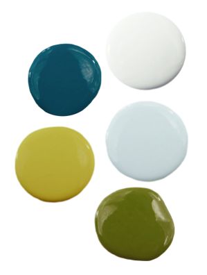
Well before we remodeled, I saw this image on Pinterest and fell in love with the colors. I loved them individually and together. So I used this palette as my guide when planning what colors I’d use in my home.

Sure, I tweaked them a little as I went (that chartreuse shows up as gold in many parts of my house), but this palette was my guide. Having a well-defined palette helped keep me in line.
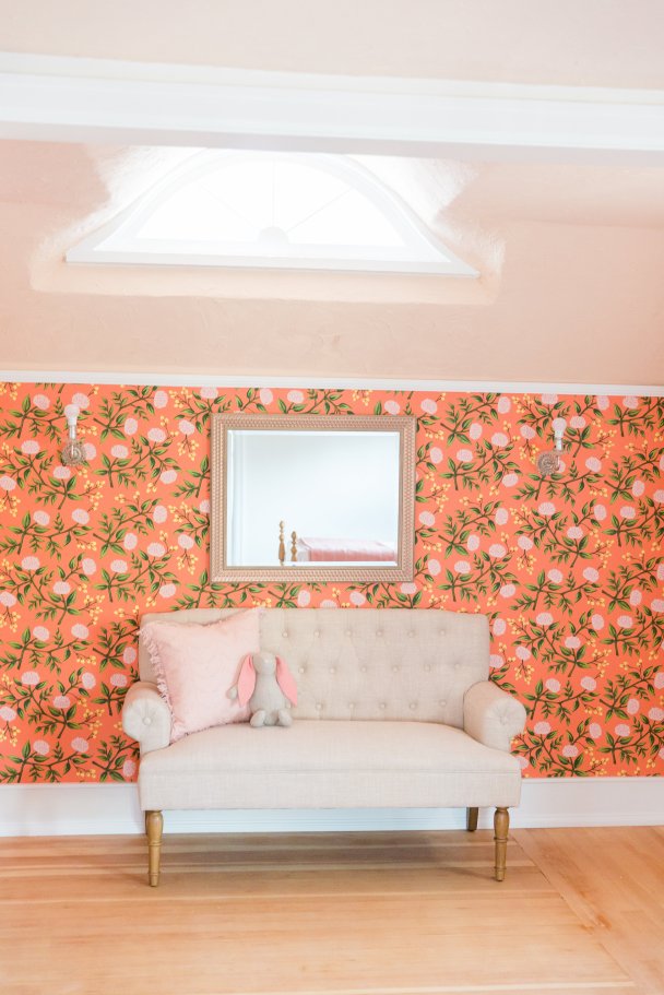
Photo by Casey James Photography
Even my daughter’s room, with its coral floral wallpaper, goes with the rest of the house because olive, yellow, and warm white are in there too—colors straight from my palette.
If your palette is comprised of three shades like light blue, dark brown, and white, it’s not varied enough. Especially if the white is on the walls, the brown is on the floor, and the blue is used as accents in every room, the depth won’t be there.
Adding a few complementary shades will make a big difference. The great news is that these changes are easy to make. Choose a palette and start adding other colors consistently throughout your house. This requires zero structural changes and might not even involve picking up a paint brush. It’s also a good idea to combine cool and warm colors for a comfortable balance.

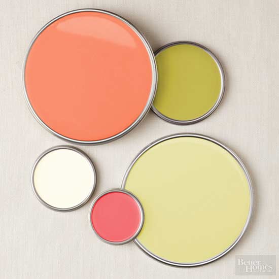
via—a pretty palette for you who love more neutral shades
I am sad to see that the source of my palette, blog.purehome.com, appears to have been taken off the internet. It looks like the site might have become part of Dezignable, and if you want to search lots of palettes, check out their Pinterest page. Save your favorite palettes, then latch onto one and run with it.
Better Homes & Gardens also produces a lot of great palettes; search these here or on Pinterest using the phrase “Better Homes & Gardens palettes.”
Later this week I have a post that’ll show how one company’s new home-décor line proves that embracing a palette is an easy way to get the depth we want in our homes. Stay tuned.
Tell me, do you follow a strict palette at home? If so, what colors do you use repeatedly? •

One thought