The other day my sister and I were talking about color and front doors. Choosing the right shade seems to be a pretty difficult task, but when you nail it, your curb appeal skyrockets.
I’m not a designer, but in my casual analysis of “good” front doors, I’ve noticed one consistency: The colors are muddy.
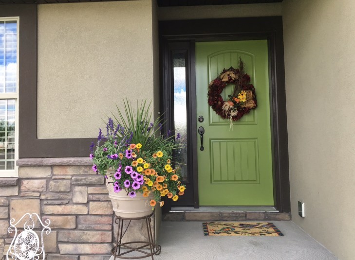
Front doors that are easy on the eyes tend to have a brown, gray, or maybe green undertone. None of them (with the exception of a true red) seem to be pure colors. Instead, pure colors come off as garish.
Let’s take orange, for instance. Here’s a house with a good-looking orange front door:

It’s dark and a little bit muddy, but it still reads as orange.
Maybe this is why Farrow & Ball colors are so popular—they are complex, and the undertones are hard to pin down.


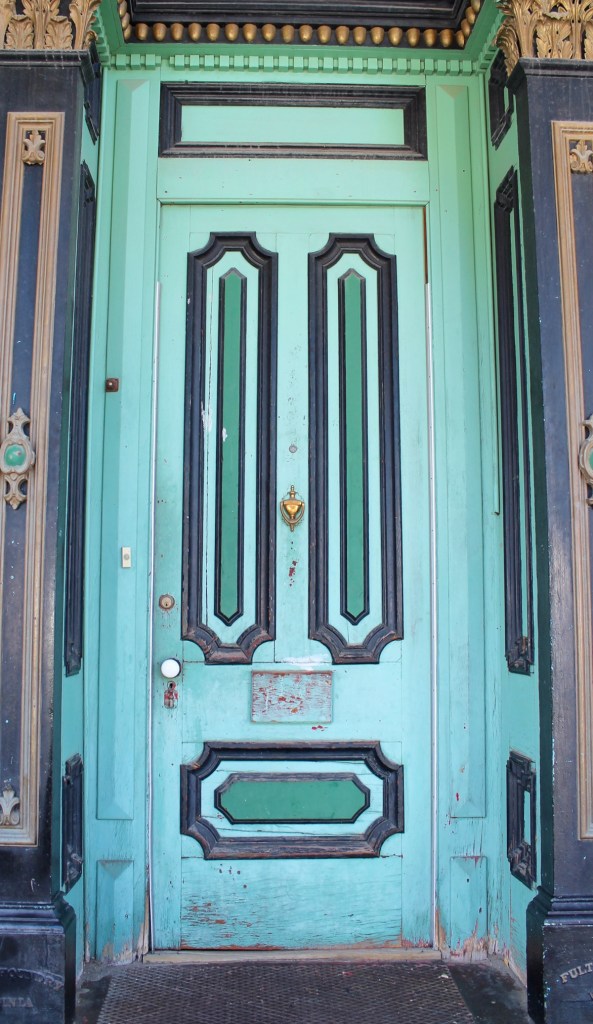
So go with dirty or muddy and get a color that appeals to the masses. Or choose the color you love best and don’t worry what anyone else thinks. Because I definitely can’t argue that the saturated color on the door below looks bad—it’s one of my favorites of all time.
That’s it for Friday. Catch you next week! •

I always love your tips, thanks!
LikeLike